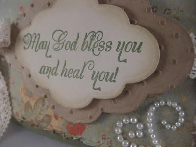
 The layout is basically the same: A square card, sentiment towards the bottom of the card, with lace tied behind it and a special bird above it.
  There are many differences in the specifics, however. In my sentiment I used layers. I also did dry embossing rather than heat embossing.
  I didn't use any flowers (I know- pretty rare for me!) but instead I tied a gold tone cross to the lace as my special embellishment.
So as you can see, CASE-ing (Copy And Share Everything) doesn't have to mean to copy exactly. By switching things around a little and changing colors, patterns, and embellishments you can make lots of varying cards from following one basic example. So next time you don't "feel the mojo" remember that you don't necessarily need to look any further than to your own cards for inspiration: maybe you just need to CASE yourself!
Supplies used:
Stamps: From Our Daily Bread Designs Get Well set
Ink: Stampin' Up! Always Artichoke; Crumb Cake
C/S: Stampin' Up! Always Artichoke; Kraft' Very Vanilla
Patterned Paper: K&Company; Vintage sheet music book
Embellishments: Cotton lace; Stampin' Up! Bird punch; Spellbinders Labels 6 dies; cross charm; pearls by ZVA Creative; Cuttlebug Swiss Dots embossing folder; distressing tool; dimensionals


 Paper crafting has become my way to share the creativity inside my soul. It is my creative outlet, my diversion, and my escape from everyday craziness. After spending years as a Stampin' Up demonstrator, I learned how to share my love of crafting with others and encourage them to find their own creative outlets. Now, instead of working for a specific company, I am focusing my time on my own creations and designing my own art. I hope to inspire others with my work and am excited to see where this takes me!


5 comments:
This card is gorgeous!! Love the musical bird.
Very lovely! I really like the lace ribbon and the cute musical bird! So pretty!
So beautiful! Love that bird punched from the music note paper. . .just the perfect topper to this beautiful card! Blessings!
Hello there my sweet friend! Sarah, your card is absolutely stunning! I love those muted colors and the lace....so beautiful! Hope all is well! Sending you hugs and blessings, Sabrina
Love that big piece of bling, the lace and the little cross charm. Very beautiful.
Post a Comment